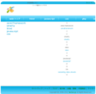
本日の記事は、背景画像に徐々に透明するdivを被る効果が表せるCSSを掲載します。
特に画像を見出しの背景とし、左から右へかけて徐々に透明にする場合、本記事を参考になれると思います。
→背景画像をご覧ください。
→CSS適用後のイメージをご覧ください。
IT技術者ならば、あまり説明がなくても理解できると思いますので、ここでソースだけを掲載します。
特に画像を見出しの背景とし、左から右へかけて徐々に透明にする場合、本記事を参考になれると思います。
→背景画像をご覧ください。

→CSS適用後のイメージをご覧ください。

IT技術者ならば、あまり説明がなくても理解できると思いますので、ここでソースだけを掲載します。
<html>
<head>
<style type="text/css">
/**************************/
.IndexImg { background: url(./img/bgImg.jpg); height:90px;}
.InfoCanvas {
 width: 100%;
 height: 100%;
 background: -ms-linear-gradient(left,
       rgba(255,255,255, 1),
       rgba(255,255,255, 0.9) 30%,
       rgba(255,255,0, 0));
    background: -moz-linear-gradient(left 45deg,
       rgba(255,255,255, 1),
       rgba(255,255,255, 0.9) 30%,
       rgba(255,255,0, 0));
    background: -webkit-gradient(linear, left top, right top,
       from(rgba(255,255,255, 1)),
       color-stop(0.3, rgba(255,255,255, 0.9)),
       to(rgba(255,255,0, 0)));
    background: linear-gradient(left 45deg,
       rgba(255,255,255, 1),
       rgba(255,255,255, 0.9) 30%,
       rgba(255,255,0, 0));
}
/**************************/
//ここから文字サイズやindentなどのCSS、無視しても構わない。
h3 {font-size:80%;}
h4 {font-size: 90%;text-indent:2em;}
p {font-size: 90%;text-indent:4em;}
//ここまで文字サイズやindentなどのCSS、無視しても構わない。
</style>
</head>

<body>
<div class="IndexImg" style="width:50%;">
 <div class="InfoCanvas">
   <h3>CSS学習手帳</h3>
   <h4>グラデーションデモー</h4>
  <p>画像の上に、左から右へかけて徐々に透明するものを被る。</p>
 </div>
</div>
</body>
</html>最新のコメント @zanmai.net

aaad @2016年03月31日
» 助かりました。ありがとう。

tinghai @2015年02月24日
» インストールしたJDKのbinディレクトリに移動してから、コマンドを実…
zanmai @2015年01月30日
» 返信が大変遅れまして、すみません。…
zanmai @2015年01月30日
» 返信が大変遅れまして、すみません。…

iPhone6plus @2015年01月28日
» その同期するめーるの期間というところがでてきません。アカウント削除しか…
admin @2015年01月26日
» mysql起動失敗の場合、mysqld --standalone…

iphone6 plus @2014年11月03日
» 図で分かりやすい。助かりました。
ありがとう

iphone6 @2014年10月04日
» iphone6の設定も同じだね

asika @2014年09月25日
» 勉強になりました。ありがとう。
zanmai @2016年03月31日
» ①②③④の順で設定できるはず。…